Thursday, April 11, 2013

Assignment 7 - Slideshow

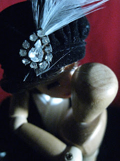
Jack and Annabelle Slideshow

After taking and looking at 200+ photos, the slideshow is finally completed. The photos are not Photoshopped even though there were several that I color corrected and cropped in Final Cut Pro. I decided not to use iMovie because the automatic Ken Burns effect irritated me and audio level control in Final Cut is less stressful to deal with.

Overall, working without images was more difficult for me because I'm not used to working without visuals. But once I incorporated the images, I literally breathed a sigh of relief. I'm glad I did this project because I've always wanted to try stop-motion but the lengthy process intimidates me. So I feel that this project is a step towards it.

YouTube link: Jack and Annabelle slideshow

Wednesday, April 10, 2013

Assignment 7 - Jack and Annabelle

Jack and Annabelle

This is just a trailer to Jack and Annabelle. I will upload the completed version tomorrow. There is one scene that I haven't yet put together.

The YouTube link: http://youtu.be/rXbTeoq3v88


Wednesday, April 3, 2013

Sound Project - Jack and Annabelle

Jack and Annabelle

This sound project is based on the Barbie and mannequin photographs that I took. Partly inspired by Toy Story and Alma, it kind of becomes Toy Story with an adult twist. This is not the final product in terms of sounds, sound placement will slightly change once I incorporate the visual elements.

 I recorded all the nat sounds with the exception of the static, heartbeat and high heels. The "voices" for Jack and Annabelle characters are downloaded off the Net. 

Jack and Annabelle Soundcloud link

Wednesday, March 13, 2013

Assignment 5: Photo Manipulation

Photoshopped Images: Before and After

An original image of a mansion that resembles an English cottage, located in Forest Hills Garden neighborhood. 


I wanted to create a vintage looking horror image inspired by the early "ghost" photographs shown in class last week. It's also inspired by a book titled This Spectred Isle by Simon Marsden, which talks about the most haunted locations in England. I layered black & white with sephia then added insane amount of grains. I also bumped the blue values all the way up. Then, I added a little something extra behind one of the windows. I used the burn tool to make the sky dark and ominous. I purposely didn't want to let the burn tool touch the roof to give the house an eerie glow (which is inspired by the Simon Marsden book). 


The cropped version of the photoshopped image. 


An original image of a Barbie doll close up.


Taking cues from the doll's dress, I decided to "turn" it into a poster for an Anna Karenina play with a slightly modern twist. The black & white halftone part represents her pretentious life with Karenin which she left behind. The full color, mozaic part represents her more exciting and passionate life with Vronsky which ultimately ends in tragedy as she figuratively and literally falls apart. 


An original image of a tree lined street with my mom walking on the sidewalk.


I selected her using lasso tool then I inversed it. Then I turned the rest black & white while keeping her full color. Afterwards, I gave it a faint yellow tint and played around with the color values. 


An original image of branches shot during an overcast morning.


Unfortunately, I don't remember which filter I used to make the branches look thicker. If I'm not mistaken, it was under the Artistic set of filters. I also turned into black & white and gave it an orange-y tint. You could some artifacts around the edges but I actually like it. The overall feeling from this shopped image is that it feels more ominous than the original.


An original image of Barbie doll with a mini wooden mannequin portrayed in a clandestine romantic relationship.


First, I fixed the white balance. It's always shocking how a little white balance fix could make an image a million times better as well as giving it a different feel. In the original image, it has a blue-ish hue which somewhat lends a secretive, dark-alley feel to it.

The second one no longer has a secretive feel but a warmer feel instead. I turned the image into a vintage inspired jewelry ad poster. I removed the doll's original earring by using clone stamp tool. Then, I added a diamond chandelier earring and a line of text using art deco font. I tried to add fake sparkle by using lens flare but it doesn't really show. I also tried to give the earring that 'partially hidden in the shadow' look but I wasn't very successful. Instead, I made it look like an earring with mismatched diamonds. So I just abandoned the idea.


Wednesday, March 6, 2013

Assignment 4: Narrative Photo Essay

Laundry Day

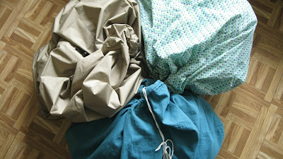
Honestly, my life is not that exciting. I thought, why not take a mind numbingly boring, mundane task and look at it from different angles. So off I went to my apartment building's laundry room on an early Saturday morning with laundry bags, detergent and a camera in tow. I made sure I was the first one to be there to avoid any weird looks. It turned out to be a pretty fun exercise. Unfortunately, my feelings toward doing laundry remain the same. 


Wednesday, February 27, 2013

Assignment 3: Three Genres of Photography

Street -- Architecture

I walked around, in my opinion, one of the prettiest neighborhoods in New York City. The Forest Hills Gardens is modeled after traditional English village so a lot of the homes resemble English cottages, which I think is unique considering its location. I purposely went out when it was overcast to give it a more 'typical English weather' feel to the pictures.


Nature -- Bald trees and flowers

I like the way branches look when the trees are bald. It has a slightly creepy but pretty quality to it, much like Tim Burton movies.


Abstract -- Sleazy Toy Story

For the abstract genre, I decided to do a take on miniature photography. Also, I wanted to do sort of an interplay of light and shadow. I dug deep into my old trunk and found the special edition Barbie doll that my dad gave to me on my 10th birthday as well as a mini wooden mannequin from high school drawing class. 


Tuesday, February 19, 2013

Assignment 2: Create an ad

Imaginary Restaurant Business


Old Nick's Kitchen is a product of my imagination and love for spicy foods. Being an Indonesian, it can be said that affinity for peppers and spicy dishes is wired in me. The idea behind this "restaurant" is that every dish would have some kind of pepper in it, including desserts and drinks, with heavy Cajun and Creole influence. Its main target customers are ones who are really into spicy foods. Hence, the slogan "go hot or go home". 

I chose a devil as a symbol to make the correlation between heat and hell ("the dishes are hot as hell"). Hence, the name Old Nick's Kitchen. The focus on peppers and spiciness is emphasized by the cauldron formed by warped texts (heat, inferno, pain, pepper, spicy, piquant, hot, zesty). The bubbling bright red liquid with peppers floating around in it further emphasizes the focus.

The devil is wearing a yellow Mardi Gras-y bead necklace with peppers hanging from it to complete its look. It's placed in the middle of the frame because I wanted it to be the center attention. I chose this particular background because it reminds me of brown paper bag and it lends a nice texture to the overall look. I want the customers to know right away that Old Nick's Kitchen is a casual, fun and unpretentious restaurant. I chose New Orleans as the location because the city is known for delicious spicy dishes and because it's a city steeped in rich history and mysteries. And it justifies why the devil is wearing a Mardi Gras inspired bead necklace. 

The devil image, the fire and log images are downloaded. I just deepened the devil's red a little, changed its eye colors and brighten the liquid's red color. The elements that I created are the cauldron, the necklace, the peppers and the texts. The fonts are called Grim Ghost Bold and Grim Ghost Outline. I imposed the bold over the outline to sort of create a '3D effect'. This ad is seemingly simple but actually has a lot of small details upon a closer look. The ad is also very centered in the sense that every element is weighted at the center. 


Wednesday, February 13, 2013

Five Advertisements - First assignment

Online Ads

This simplistic Heineken advertisement poster reflects balance, symmetry, repetition and grouping. 

Balance: the bottle is placed right in the center of the frame.

Symmetry: Although symmetry is defined as having identical arrangements on both sides of the axis, this poster can also be categorized as symmetrical because it has equal empty space on the left and right side of the bottle. Also, the green texts are of equal distance from the top and bottom of the bottle. 

Repetition: The passport stamps are repeated many times. Although the colors are not uniform, the sizes are about the same. 

Grouping: The passport stamps are grouped/ arranged to resemble a bottle.


This resplendent advertisement poster for Discovery channel's Life reflects contrast, symmetry, figure/ground relationship, and positive/ negative.

Contrast: There are several contrasts in this composition; it contrasts rich reddish orange with cool dark blue/ gray, the lime green 'life' text stands out against the reddish orange, and the white texts below contrast against the dark blue. In a more obvious way, this poster contrasts nature in terms of ecosystem on dry land and ecosystem under water. 

Symmetry: With the water line acting as a 'divider' between two contrasting colors, the composition reflects symmetry because both halves have similar object arrangements albeit different contents. 

Figure/ ground relationship: The large lime green 'life' text and the white texts are the figures while the complex ecosystems rendition serves as the ground. 

Positive/ negative: The reddish orange hue is the opposite of the dark blues and grays. 


Billboard ad

This is an enamel advertisement sign circa 1930s. I took this photo in a   Batik atelier in Surakarta, Central Java several years ago. Not exactly a billboard ad but from design and historical perspectives, this is one of the most memorable ad signs I have ever seen.     was a Javanese cigarette company that existed during the Dutch occupation era in Indonesia. The Javanese word prijaji (now spelled priyayi) is associated with wealthy and educated individuals from elite noble families. This particular ad sign depicts a Javanese prince in traditional garb smoking a Prijaji cigarette. The message was that Roko Prijaji was the elite nobles' cigarette of choice and commoners can feel like nobles too if they smoke Roko Prijaji. 

If analyzed through the design criteria from Mediapedia, this advertisement sign reflects asymmetry, contrast and thoughtfully placed text positions.

Asymmetry: The prince figure is not placed at the center of the frame. Rather, it is placed slightly on the right of the frame.

Contrast: There are several contrasts in this composition; the red 'Roko Prijaji' texts stand out against the yellow, the yellow 'sigaret' text stands out against black, and the prince figure stands out against the simplistic red/ orange/ yellow background.

Thoughtfully placed texts positions: Although its design is straightforward, the words are actually thoughtfully laid out. The word 'prijaji' is large, emboldened, curved and placed right on top of the prince figure to immediately attract attention to the brand name. And the 'sigaret' is also large and emboldened to immediately draw the eyes as to what kind of product it advertises (even though it's placed on the bottom). What's odd is the word 'roko', even though on top, is smaller and not in bold. Perhaps because it's right on the top, it doesn't need to be large and emboldened. 


Print ad

This Dockers magazine ad has a mannish feel to it as represented by the posture and build of the figure, the somewhat grime-y background, the phrase "wear the pants" (as if to emphasize the point that real men wear Dockers cargo pants) and the men associated words inside the silhouette i.e. Dad, Father's Day, neckties, man behind the curtain, etc.

Analyzed through the design criteria from Mediapedia, this ad reflects balance, grouping and visual frequency.

Balance: The "half-naked" male figure is placed at the center of the frame.

Grouping: The words are fit and cropped inside the male figure's body. Also the all caps bold texts "WEAR THE PANTS"  along with the brand name Dockers and the logo are grouped on the top left to draw attention to them. 

Visual frequency: The texts inside the male figure can be said to have visual frequency because the distance between them are close to identical. 

There is a lot going on in this Kohler magazine ad. Unlike the Dockers cargo pants ad, this has a decidedly feminine feel to it. The ad depicts a wedding reception venue in which two scratched up bridesmaids in torn dresses are fighting over a bouquet and using champagne bottles as weapons. What immediately draws attention is a pretty blue sink being used as a champagne bottles holder. Then your eyes are drawn to the bridesmaids then to the upper right black box which says, "Chill, ladies. Take a clue from our entertainment sink that chills champagne". 

Analyzed through the design criteria from Mediapedia, this ad reflects balance, symmetry, figure and ground relationship, direction and mirroring. 

Balance: The sink is placed at the center of the frame; a classic theory that the most important object is placed at the center. 

Symmetry: This ad can be described as having symmetry because the bridesmaids are horizontally aligned and the sink and chandelier are vertically aligned.

Figure and ground relationship: Although the eyes can easily be drawn primarily towards the bridesmaids, the figure is actually the sink. The sink is located front and center while the bridesmaids (although prominent in their own rights) are actually part of the background. 

Direction: The way the two bridesmaids are 'meeting' in the middle helps draw the eyes down toward the sink. 

Mirroring: Although the two bridesmaid figures are not identical, they are close enough to engage the eyes in comparison. It's a typical mirroring position with the two figures meeting in the middle axis from the left and the right side.